
Your social media graphic might look good, but can your audience actually read it?
When creating content for your business, it is easy to focus on making a graphic visually appealing. You choose your brand colors, add photos, experiment with fonts, and include all the information you want your audience to know. But if your graphic is difficult to read, your message could get lost.
Hard-to-read graphics can make people scroll past your content before they ever understand what you are trying to say. On social media, you often have only a few seconds to get someone’s attention. Your audience should be able to quickly look at your graphic and understand the main message.
Why Readability Matters in Social Media Content
Most people view Social Media Content on their phones, which means your graphic is being displayed on a much smaller screen than the computer you may have used to create it. Text that looks perfectly readable while designing on a large screen can suddenly feel tiny when viewed on a phone.
Your audience is also scrolling quickly. They may not stop to zoom in, study your graphic, or try to figure out what it says. If the message is not clear, they can simply move on to the next post.
Good Content Creation is not about fitting as much information as possible into one graphic. It is about communicating your message in a way that is easy to understand.
Watch for These Common Graphic Design Mistakes
When creating graphics for social media, watch for a few common problems that can make your content harder to read.
• Too much text. If you have several paragraphs of information on one graphic, consider moving the details to your caption or turning the content into a carousel.
• Difficult-to-read fonts. Decorative and script fonts can add personality, but they can also become difficult to read, especially at smaller sizes. Use them carefully and choose clear fonts for your main message.
• Poor contrast. Your text needs to stand out from the background. Light text on a light background or dark text over a busy photo can make your message disappear.
• Text that is too small. If someone has to zoom in to read your graphic, the text is probably too small.
• Too many competing elements. Multiple fonts, photos, shapes, colors, icons, and blocks of text can leave your audience unsure where to look first.
Give Your Graphic One Main Job
Before designing a social media graphic, decide what you want someone to notice first.
Is it a question? A tip? An announcement? A special offer? A helpful reminder?
Make that message the focus of your design.
For example, a lawn care company sharing a seasonal tip might put “3 Ways to Prepare Your Lawn for Summer Heat” prominently on the graphic. The three detailed tips can go in the caption or on additional carousel slides.
A photographer promoting seasonal sessions might use “Fall Family Sessions Are Now Booking” as the main text instead of trying to fit dates, pricing, available times, locations, and booking instructions onto one graphic.
A restaurant promoting a new menu item can feature the name of the dish with a strong photo, then use the caption to share the ingredients and additional details.
Your graphic gets someone’s attention. Your caption, carousel, website, or call to action can provide the additional information.
Use Visual Hierarchy to Guide the Reader
Not every piece of text on your graphic needs to be the same size.
The most important message should usually be the easiest thing to notice. Supporting information can be smaller, but it should still be easy to read.
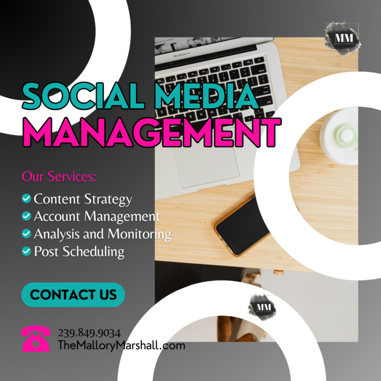
Think of your graphic as having an order.
What should someone read first? What should they read second? What action should they take next?
If everything on the graphic is competing for attention, nothing stands out.
Keep Your Branding Consistent Without Overdoing It
Brand consistency is an important part of building Brand Awareness, but that does not mean every graphic needs to include every brand element.
Using consistent colors, fonts, and design elements can help your audience begin to recognize your content. However, adding too many branded elements can make a design feel cluttered.
Keep your branding recognizable while allowing enough open space for your message to stand out.
Always Check Your Graphic on Your Phone
One of the simplest steps you can add to your Content Planning process is checking your graphic on your phone before publishing it.
Ask yourself:
Can I read the main message immediately?
Is the text large enough?
Does the text stand out from the background?
Do I know where to look first?
Is there anything I can remove?
Can I understand the point without zooming in?
If the answer to any of these questions is no, simplify the design.
Sometimes removing one block of text, increasing the font size, or changing the background can make a big difference.
Simple Does Not Mean Boring
A simple graphic can still be creative, branded, and visually interesting.
The goal is not to remove all personality from your designs. The goal is to make sure your creativity does not get in the way of your message.
The next time you create Social Media Content, remember that your audience needs to understand your message before they can act on it.
Before you hit publish, look at your graphic from your audience’s perspective. If you cannot quickly read and understand it on your phone, simplify it.
Clear content makes it easier for your audience to stop, read, and understand what your business has to say.
Save this Social Media Marketing tip for your next Content Planning session and use it as a quick checklist before publishing your next graphic.